Information architecture
Innovation Team: Pia Kendrick (Lead Product Manager), Carrie Taylor (Lead UX Designer), Dirk Petersen (Lead Content Strategist), Miles Stanfield (Backend Engineer), Jake Burch (Frontend Engineer), Michael Todd (UI Design)

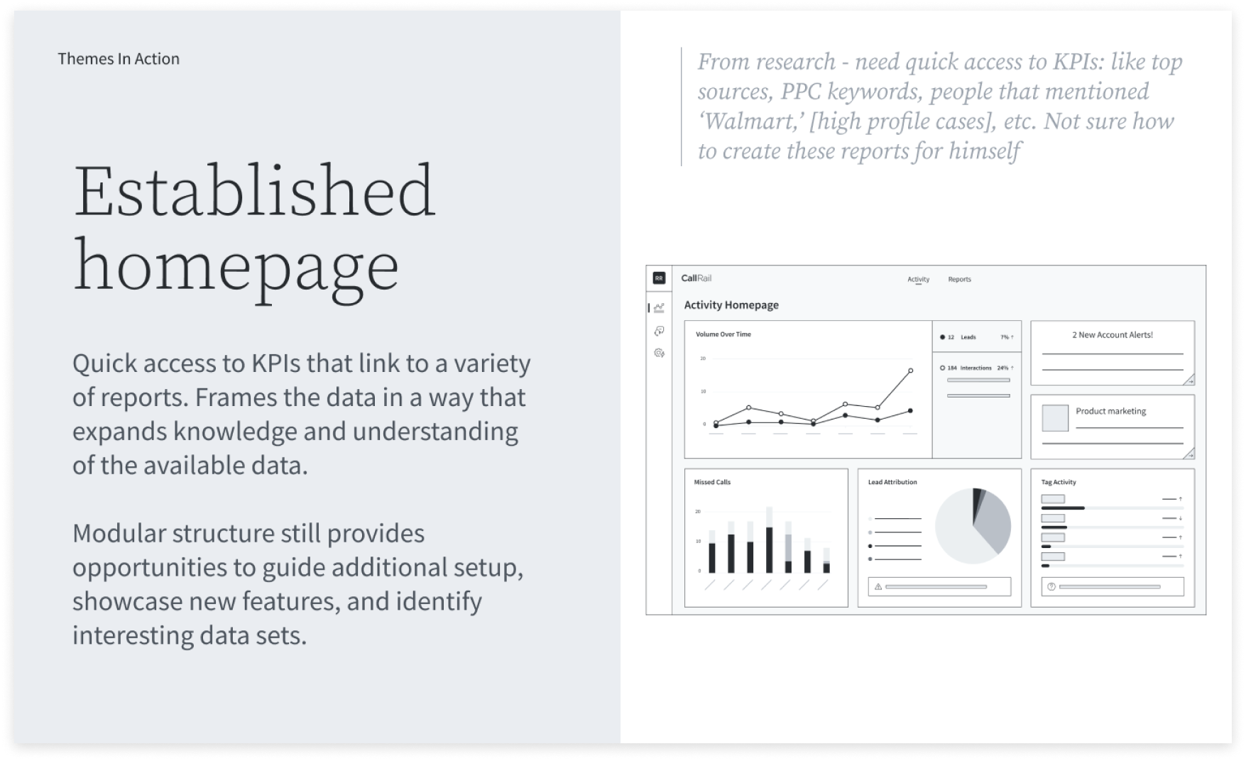
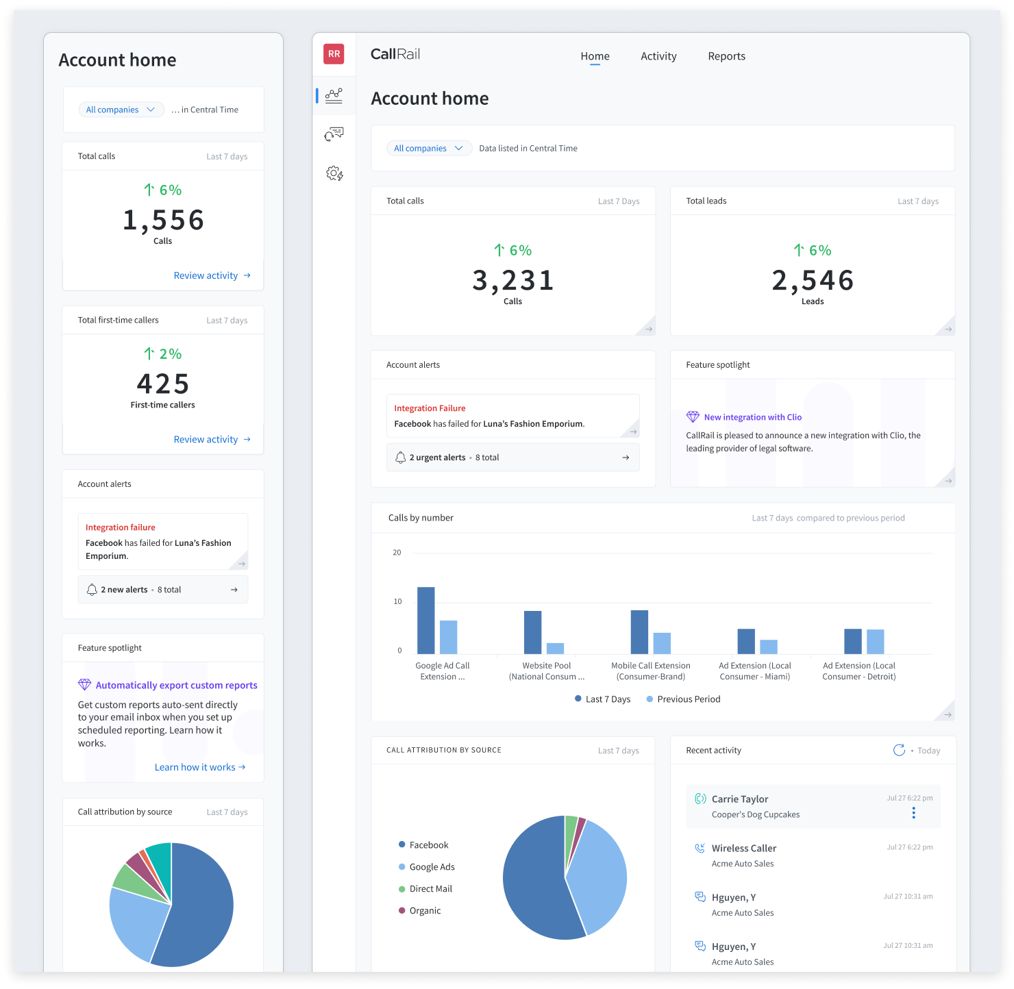
Dashboard final design, launched Jan 2023.
Feature spotlight content in upper right links to a blog post announcement of the new homepage.
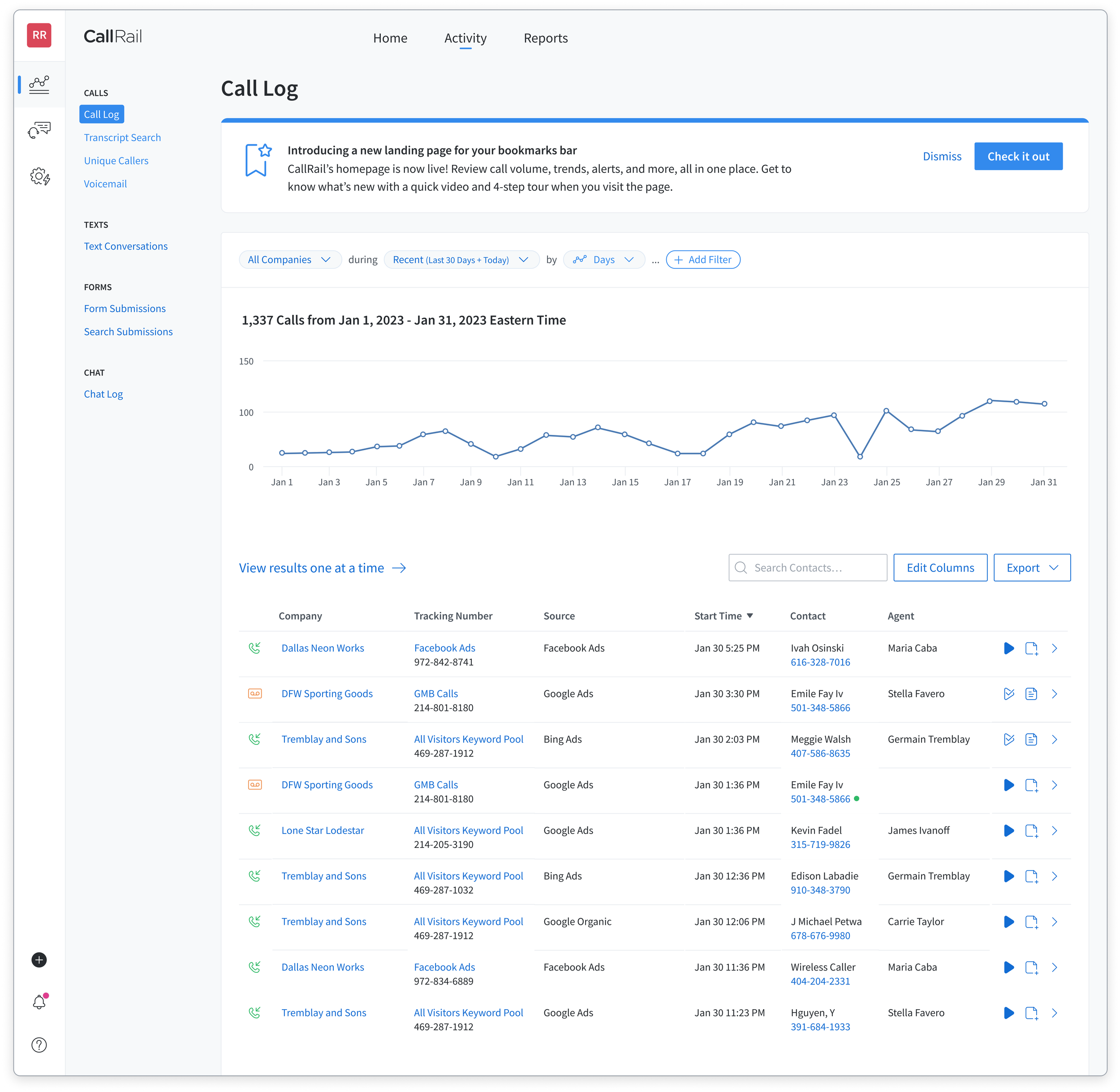
Call log, the original CallRail app landing page since 2012.
Users who navigated to CallRail from a browser bookmark saw a banner announcing the new dashboard and navigation change.
Project overview
This project was initiated to reduce traffic to the Call Log which had been the landing page of the app for 10 years and was starting to cause latency issues (bottom left). We were looking to provide a solution that clearly represents the value of the CallRail platform (bottom right).
Understanding the problem space
From developing the Analytics vision with the director of product (bottom left), learning from historical concepts and workshops (bottom right), and designing reports as well as many other areas of our app, l felt familiar with reporting limitations, user personas, and product strategy of our platform.
Analytics North Star, presented Aug 2021.
Developed from previous research, we knew users desired a dashboard and quick access to metrics.

Concepts from previous years, dating back to 2017.
The company had an appetite for a new homepage, but faced development resource and database limitations.
Identifying target users
In order to decide which data would be most valuable for users when they log in, I needed to deepen my u of understanding of user motivations, needs, and behaviors. We didn’t have a user researcher on the team at the time, so I analyzed and synthesized relevant qualitative and quantitative data (bottom left and right) from previous research projects and shared the findings widely across the department to achieve alignment and rigor.
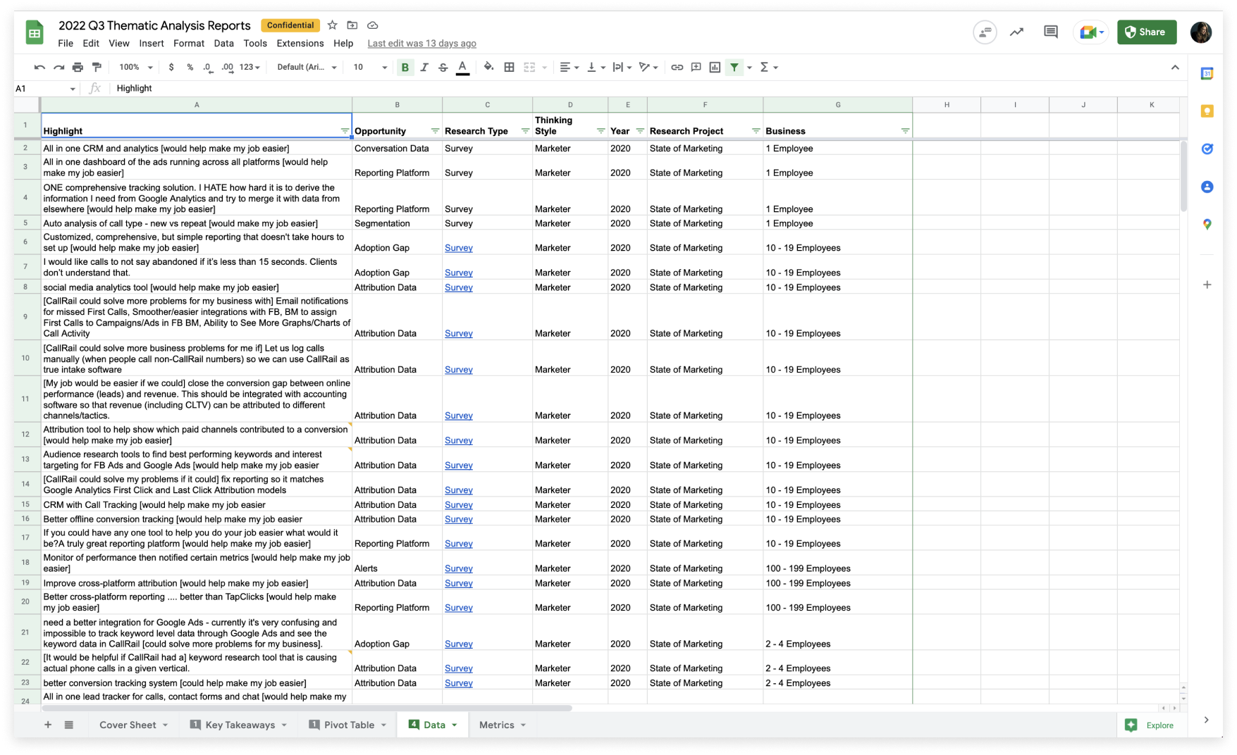
Analysis of existing qualitative data.
Research collected from past surveys and interviews began to shape the design and content for the dashboard.

Synthesis of quantitative data.
Reports engagement and traffic metrics gathered from Fullstory, Pendo, and Google Analytics.
Working towards a solution
We wanted to use a mix of data visualizations while combining sets of data to surface insights and trends while also ensuring all data is immediately actionable and provides value to our customers (bottom left). The cross-functional team met weekly in working sessions and we had extensive conversations as the design took shape. Through this collaboration, we learned what was possible and was not possible to display on the dashboard. For example, we needed to work with a short date range for performance, and we could not display live data (bottom right).
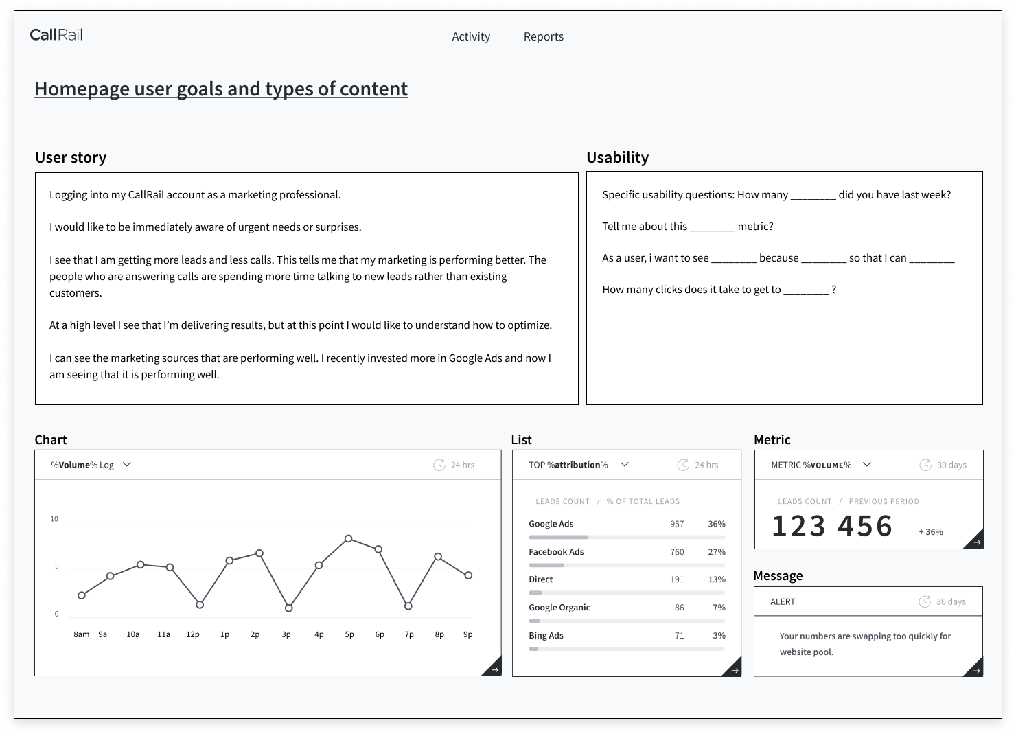
High-level direction setting
Designing a dashboard for all users with any product was challenging, so we used this visual to help facilitate conversations for storytelling, usability, and data visualization.
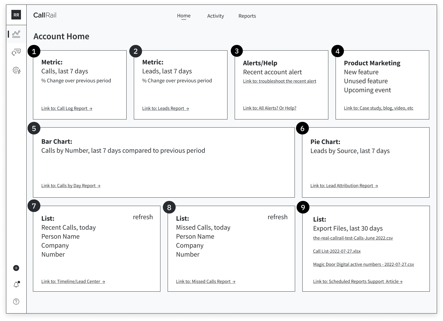
Low-fidelity wireframe
This early wireframe was essential for conversations around feasibility with engineers. It also allowed the team to design and build together, much like agile.
Testing and refining the design
The team partnered with our account managers and sales representatives in order to speak with users that expressed a need for a marketing dashboard, so we collaborated with our user researcher to write a research plan and script. In addition to speaking with existing users, we also tested our designs with marketers who don’t currently use Callrail via UserTesting. We learned that some modules were not as informative as others and the term “lead” was not clear and needed more definition.

Evaluative research plan
Having a research plan helped us stay organized and focused during our evaluative testing.
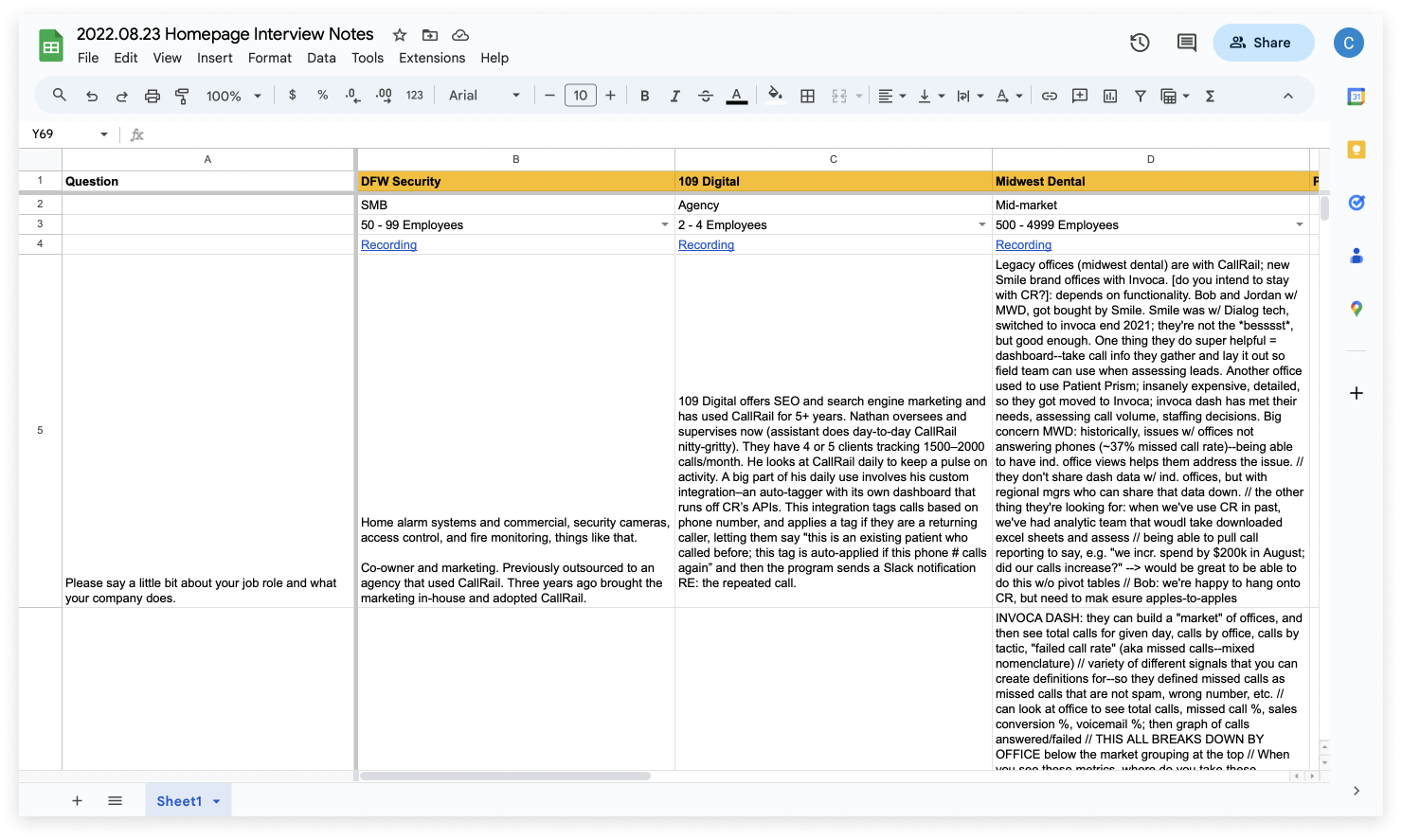
Group interview notes
As a group, we take notes in Google Sheets to more easily compare qualitative results and identify patterns.
Designing variants
While we tried to design a dashboard that is valuable to all users, we knew that there may be a timeframe in which an account may not have any data to display and there are possibilities of timeouts or errors in displaying data. We designed fallbacks for each module as well as for smaller width screens, a practice that I’m familiar with from my previous agency work.
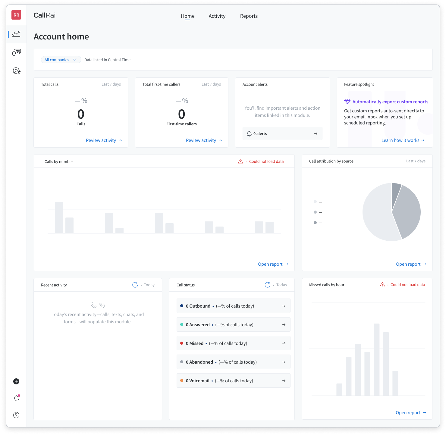
Fallback designs for no data and errors.
Especially because some modules display data for short date ranges, we needed to account for empty states.
Responsive design for smaller width screens
CallRail pages are not mobile responsive, so we were excited about the opportunity to design a page with mobile in mind.
Measuring success
As the new landing page, the dashboard reduced pageviews to the call log by 20% (2M to 1.6M), improving app performance. The dashboard also increased unique visitors to a key report by 80% (2.1K to 4.7K) and report filter usage increased by 11% (20K to 26K) per month.

Quantitative measures of engagement
Using Fullstory, I was able to track the impact of the dashboard on visitor traffic and engagement of reports.

All pageviews vs. call log pageviews
Using Google Analytics, I identified a decrease in pageviews on the call log which reduced the load on the system.